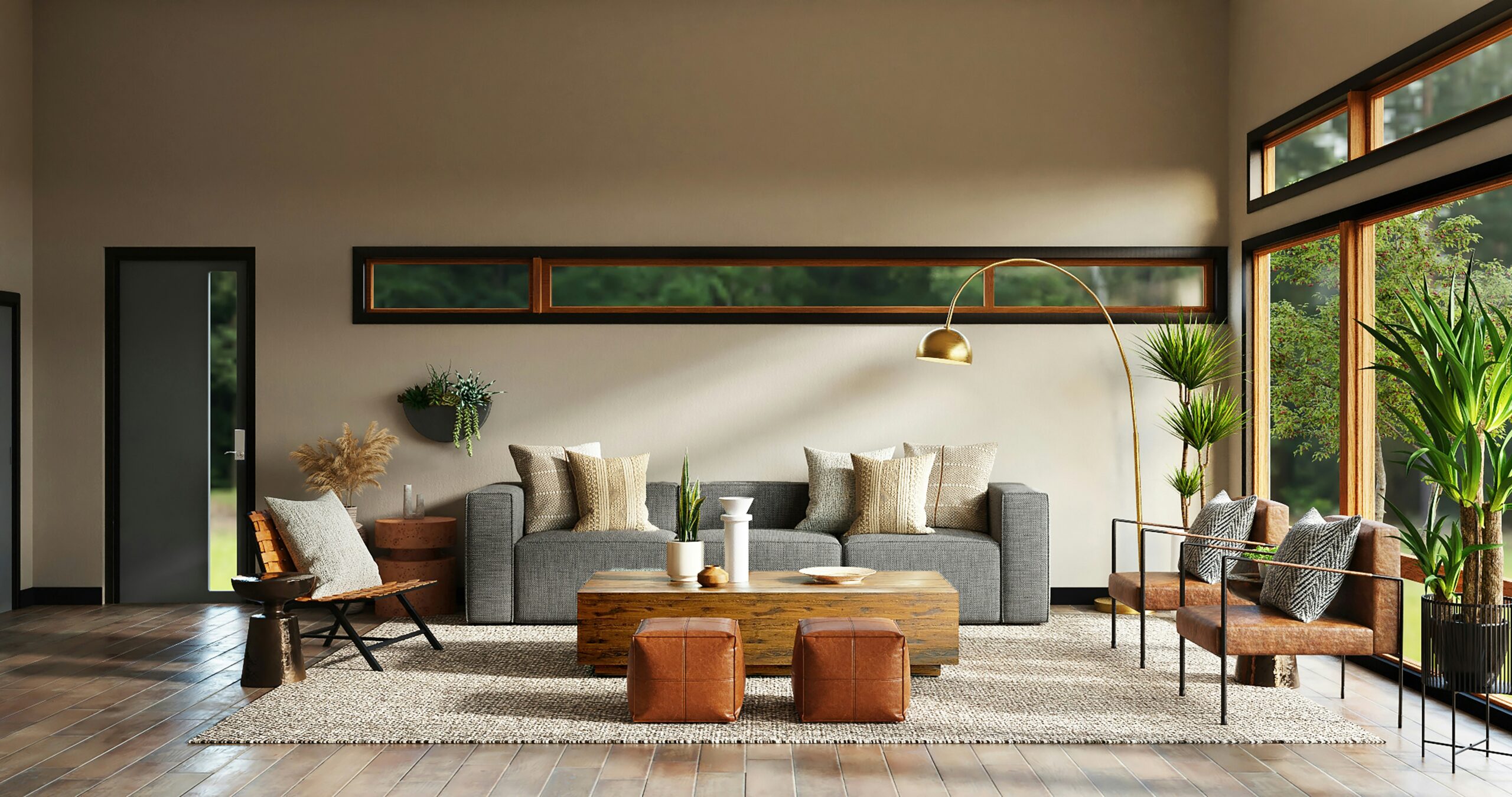
The Psychology of Color: How to Choose the Right Palette for a Home Office
The effects of color aren’t the same for everyone. It all depends on a variety of different factors including a person’s culture, age, and gender. But generally speaking, some colors work better than others at inspiring creativity or sparking your mood.
Blue
Blue is considered one of the best colors for a home office. It’s incredibly calming and is also proven to lower your heart rate and reduce anxiety. However, it may not be the best color if you need to stay awake and alert since it’s also said to be a color that invokes feelings of sadness.
Yellow
Yellow is the best color for creativity. It’s sunny and welcoming making you feel happy and optimistic. But some studies suggest that people are more likely to lose their temper in a yellow environment and babies tend to cry more. Make sure you’re choosing appropriate hues of yellow so it doesn’t overpower your workspace.
Red
Red is an excellent color to boost your energy level and increase your heart rate. It also poses a sense of urgency often used in clearance sales. However, you might not want to paint your entire home office in red. Scientists say that the color red can make you feel hostile and agitated. It is also believed to raise blood pressure and cause irritability.
Green
Green is a calming color for a home office and is associated with unpolluted nature. It’s also a great color to think about new concepts and ideas. However, it’s said that the color green decreases physical activity, which might make you feel tired and lazy in the end.
Why color is a work tool, not just decor
Most folks think of wall color as the final nice-to-have detail in a home office. But the reality is that color is a sensory experience that hits your brain before you’ve even opened your eyes; it can actually affect your nervous system, raising or lowering your arousal levels and shifting your mood. Color can change virtually any aspect of your performance for better or worse, from sharpening your cognitive abilities to hampering them.
A 2009 University of British Columbia study by Juliet Zhu and Ravi Mehta, for instance, reported that the color red boosted performance on detail-oriented tasks, while blue boosted performance on creative tasks. That’s not a one-off finding – all colors have some association with either increased or diminished cognitive performance on some tasks.
The 60-30-10 rule in practice
Here is the ratio that keeps a palette from turning into visual noise: 60% is your dominant wall color, 30% is your secondary tone through furniture or flooring, and 10% is your accent through smaller accessories. It’s a pretty simple concept, but it’s also what separates a room that feels like you meant it to appear that way from one that you genuinely need to vacate for an hour while your eyes reboot.
That last 10% is where most people either nail it or squander their shot. It’s the one small chance you have to bring in actual color and not have to repaint or reupholster anything, which makes it the layer we should all be paying the most attention to right now. Rugs, throws, throw pillows and wall art allow for necessary color experimentation, warmth injection, pattern or holiday cheer without a single brushstroke. Find the great stuff at places like lustria.com and your accent layer is full of pieces that actually hold visual weight.
Cool tones as your safest foundation
For the vast majority of home offices, soft blues and muted greens are the low-risk play. They’re on the cool end of the spectrum, and time and again have been associated with feelings of calm and sustained concentration – not so much buzz and urgency. If your work day regularly involves long, methodical spells of writing, reading, or deep thought – and you need to stay as undistracted as possible – a cool base will afford you that.
Where warm colors actually belong
Discussions about office design often highlight a severe prohibition on reds, oranges, and yellows. In reality, these warm hues can be used but like many ‘mindful’ elements in this list, it comes down to restraint and quality. High-intensity warm colors, for example, are known to increase tension, and large doses can even cause anger – not exactly the environment you want to foster in a workplace, especially one that ideally promotes calm productivity.
Neutrals for small or dim spaces
If you have a small office with little natural light or if your office also functions as a guest room, a neutral base is almost always the best call. White reflects whatever light there is; greige and warm beige don’t energize a room, but they let in what light there is instead of drinking it up the way a deep hue does. Neutrals are also good insurance: You won’t regret a neutral in a few years the way you might a bold choice, and if you decide to repaint in five years, at least it will be a six-hour job, not six days.
Test before you commit
The lighting in your room can make a huge difference in how a paint color is perceived. The quantity of light as well as the source of light influences everything, turning what was a perfect shade of gray in the morning into a muddy lavender by evening.
The same paint color can look entirely different from morning to night. Morning light, afternoon light, and your lamp-light at 7pm will pull different tones out of the same paint swatch. This is why paint color selection must happen in the exact room you’ll be using it in.
Building a palette that works for how you work
You don’t land on a good home office palette by endlessly scrolling Pinterest. You find it by first determining what type of work will go on in that room, selecting the right base coat to support it, and then adding personality with the accent color. Get those proportions dialed in, sample it in your own light, and this space won’t just be beautiful. It’ll be thoughtful too.
Leave a Reply